David Kassan • • 8 min read
An Artists Attempt To Revolutionize Portrait Painting – A Personal Story By David Kassan
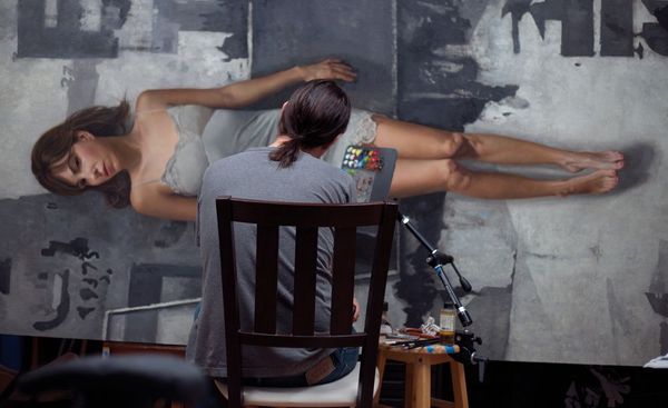
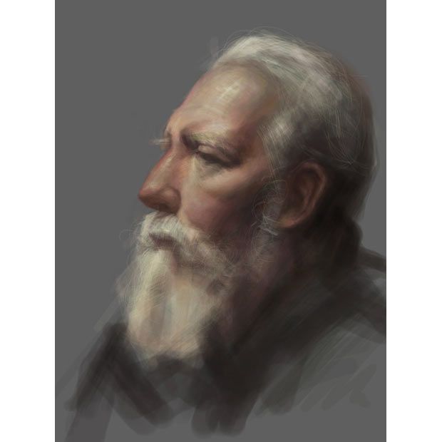
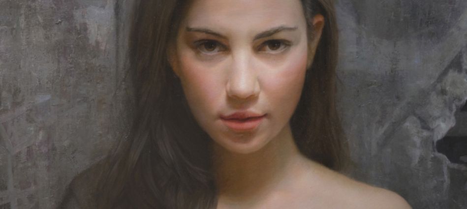
David Kassan (born 1977 in Little Rock, Arkansas) burst onto the scene in 2010 when the media caught tail of his hyperreal iPad paintings (like the one to the right.) Yes, that was painted with just his fingers on the busy streets of New York.
Kassan is now stirring up the art world once again with his highly successful Kickstarter campaign which aims to completely reinvent the way portraits are created.
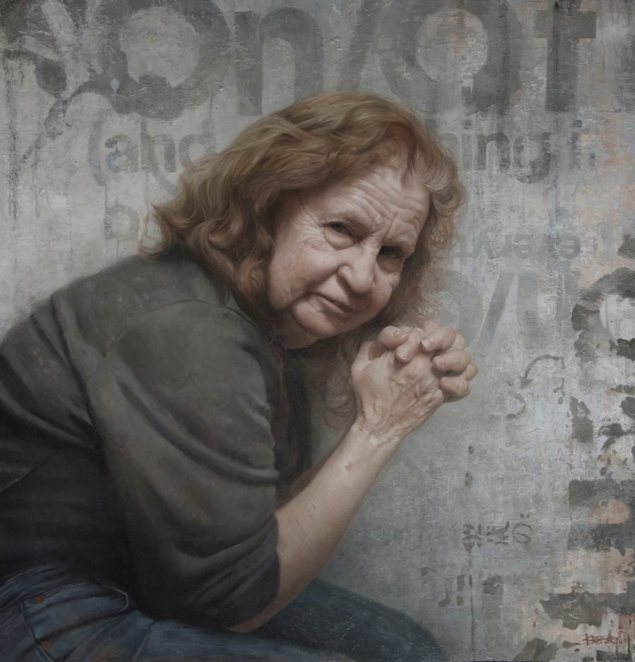
Kassan’s approach to art differs from most of his contemporaries because while he is classically trained, he isn’t afraid to divert from the trodden path. Along with his iPhone and iPad paintings, he often combines classical portraiture with urban graffiti backgrounds – bridging the artistic gap between the centuries.
In this post David shares with us his personal story on how the setbacks in his artistic career propelled him to reinvent a time-old tradition — the painting palette.
Why I Had to Reinvent The Artist’s Palette: By David Kassan
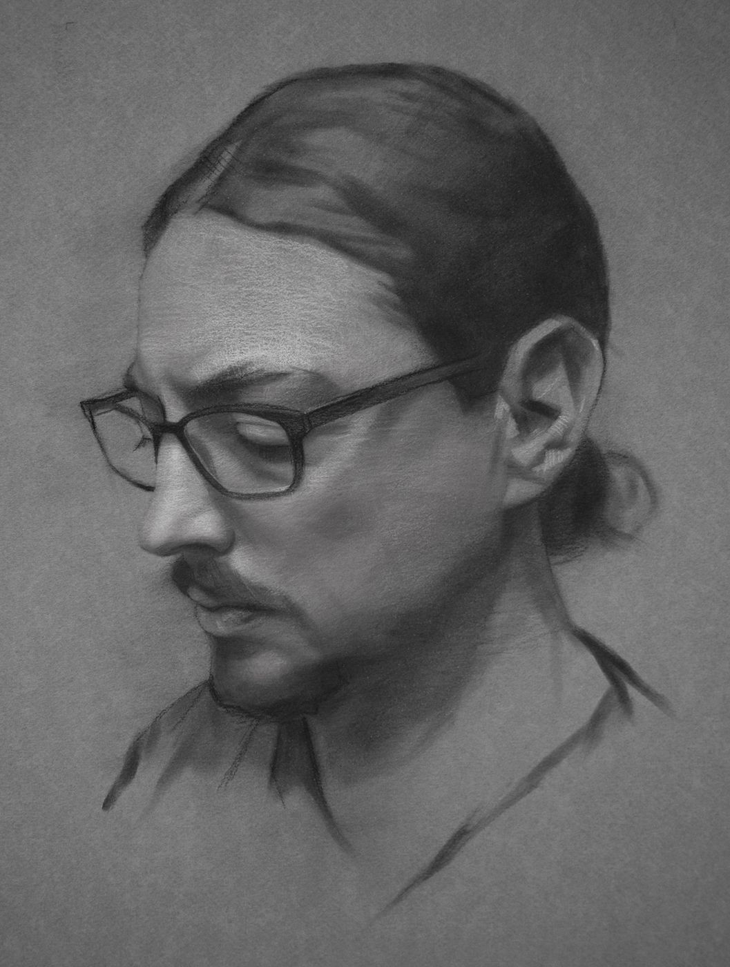
To any painter, palettes are very personal. As the extension of our hands, they represent our artistic history and are closely linked to the work that we have created.
Palettes are the sounding board for our visual notes while our paintings are the collection of all of our thoughts on the subject. The closer that our painting and palette are in harmony with each other, the easier and clearer it is for us to express our thoughts.
I’ve always had a fascination with different artist’s palettes. There are a number of palettes on view at the Salmagundi club in Manhattan that belonged to amazing painters like George Innes and Howard Chandler Christy.
Perhaps I’m just a fan of painting so much that I can’t get over the romance these palettes hold for me, but I can’t help to realise they are literally soaked with the history of their paintings. I guess it’s this similar romance that has compelled me to hold onto my palettes for the past 13 years.
The 13-Year Evolution of My Painting Palette
This timeline is the short history of the evolution and development of what I have used to mix my color for the past 13 years, from my student days at the Art Student’s League to the work that I’m creating now.
The design of my palettes have always been very fluid over the years and have co-evolved to meet both my physical and painting needs. Each change and feature has been developed through years of daily practical use with the deliberate intention that the palette, for mixing my paint, will become completely intuitive and seamless in painting process.
In 2001
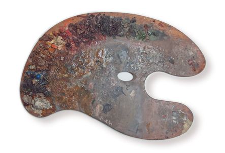
I was not satisfied with my skill level as a painter. So, instead of continuing a career in web design, I decided to go back to school to learn how to better paint from life.
The first palette that I gravitated to in those days was the one that is imbued with history, the traditional Kidney-Shaped Palette.
The traditional Kidney-Shaped Palette has been used for hundreds of years and really hasn’t seen any advancement other than slight variations to the shape.
My classes at the League and National Academy were really intense. We were painting five days a week, three hours a day. And I would do two or three of these classes a week, so naturally holding the large Kidney Palette got old quick.
The standard classroom setup is an easel with two stools in front of it to hold your supplies, after a few weeks of consistent painting, I started moving my palette to the stools in front of me.
In 2003
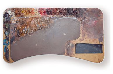
I won a grant to study painting in Italy, and after arriving there I spent a lot of time sketching while on the trains moving from town to town.
I was blown away by the inventiveness of the artists from the Renaissance, mostly Brunelleschi and Da Vinci.
Since I’m a pretty pragmatic guy I just started sketching ideas that could help me paint better. One particular idea I had was to make a Palette that I could use in my life painting classes that would sit on the school stools better, in a more balanced way than the traditional Kidney-Shaped Palette that I was currently using.
I had read a theory about worktable design that explained how an inward curve was more inviting for a user than an outward curve that “pushes” the user away. I immediately thought of how the design of the traditional Palette that I was using wasn’t designed for the way in which I was using it.
This insight inspired me to come up with The Inward Curve Stool Top, a palette design that included the inward curve and even had a section for the artist’s brushes with a pad that helped keep the brushes from rolling off.
Read: Carl Jung and the Artistic Impulse: Madness in the Creative Spirit
After a little more than four years of heavy duty painting at the Art Students League, I started to get some serious lower back and side pains from standing at my easel all day. I was repeatedly twisting down since I had to mix my colors every few seconds. I had developed a painful repetitive stress disorder while I never had any back issues in the past. I thought that the only way I could continue to paint was to somehow get the palette up next to the painting.
In 2005
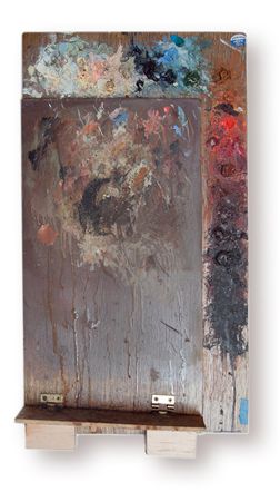
Keeping with what I knew about painting at the time, I made the first palette out of the traditional materials that I was painting on, wood. Shortly after putting the palette parallel to the painting I was working on, my lower back and side pains disappeared.
Now I was only moving my shoulder to paint and my neck to shift my eyes from the model to my palette and then back to my painting, in a much more efficient fluid movement.
After using the wooden vertical palette for a few years, I had switched from painting on plain white canvas to using a mid-tone warm grey ground color so that I could see the color values better right from the beginning of a painting. I was also using some different supports to paint on that were lighter and more archival, mainly dibond panels.
In 2008
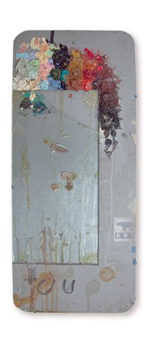
I revised the wood design by making it out of dibond, which is an aluminium composite material, and used glass for the mixing area so I could mix in the same grey color base that I was using for my paintings. I also added two elastic loops to hold different sized medium cups so that the mediums were closer to the mixing area and wouldn’t slip or fall over.
The glass was great and super easy to clean up after a painting session or even after a few days. I discovered how easy denatured alcohol removed the paint from the glass, so much easier than scrapping away at the wood surface that I was used to.
By only painting from life for so many years I feel this knowledge is now reflected in my finished palette.
In 2011
I teamed up with product designer, Steve Ericson, to test the market for the Palettes. His wife, Kathleen, had seen me demo-ing my painting technique using the vertical palette. I’d found that it is immensely helpful for painting demonstrations because the students/audience can see exactly what I’m mixing on the palette as I paint.
We thought of two different sizes, a studio- and travel-sized version, and set out to add a number of different features that was a collaborative effort. We added the brush/medium cup holding shelf and a tripod thread on the back so that the Palette could be attached to any tripod and easily released.
We also added the main new feature of being able to slide any color underneath the mixing tray area so that one’s mixing color space would match with the color space of a painting. Only a year after we launched the Parallel Palette we had to stop taking orders because of an overflow; we couldn’t keep up with them.
It was challenging for Steve, who was hand making them and filling the orders by himself because I didn’t have the space in Brooklyn to help out. This initial foray into the market was extremely promising but the production would need to be better thought out. Once I started using the Parallel Palette, my brain was firing away at some new features that would really increase the palette experience and these features were out of our expertise to implement at the time.
In 2014 and Beyond…
The goal has always been for me to make the palette become an extension of the artist, something that is seamless with the process so that there is no friction or distraction between the artist’s eye and the painting. About six months ago over beers one night, a very close friend of mine, David Lemyre, who is a jack-of-all-trades, including painting and building anything possible, brought up the idea of reviving the Parallel Palette.
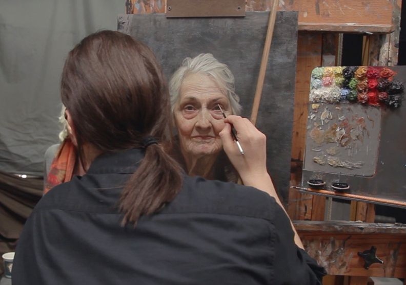
I had been concentrating on making my “Painting a Life” film for the past year and had shelved any thoughts on going forward with the palette project, even though I had some cool features that I wanted to add. I had just released the film, which had been way more successful than I had imagined, and so I was interested in doing another cool project. David and I grew up together and I have always known how intellectually curious he was. He gets awesome things done and after I told him my ideas for the new features and he immediately got it engineered and sourced.
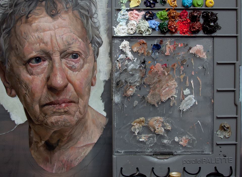
The results of this collaboration is the new Parallel Palette v2.0
Bonus: David Kassan’s Top 6 Books for Artistic Mastery
- The Art Spirit by Robert Henri
- What Painting Is by James Elkins
- Oil Painting Techniques and Materials (Dover Art Instruction) by Harold Speed
- Classical Painting Atelier: A Contemporary Guide to Traditional Studio Practice by Juliette Aristides
- Lessons in Classical Drawing: Essential Techniques from Inside the Atelier by Juliette Aristides
- Bridgman’s Complete Guide to Drawing from Life by George Bridgman

